-
Architects: Whiting Architects
- Area: 240 m²
- Year: 2013
-
Photographs:Sharyn Cairns
-
Manufacturers: ERCOL, Nectre
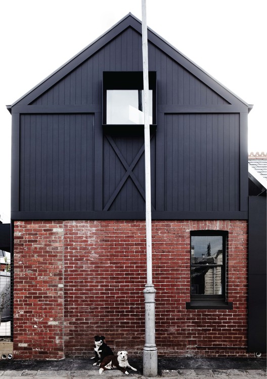
Text description provided by the architects. Recognisable ‘dignity-of-style’ developed through familiar forms and archetypal elements.
A child’s drawing of a house; rectangular-shape, pitched-roof, high-window, featuring primary-forms and simple-geometry. Reading as an archetype, a prototype; the first in a run.

‘Making’ something that just ‘feels-right’ through a subliminal, intuitive interpretation of subconsciously familiar architectural elements; corrugated-iron-roof, gable-ended-pitched roof, square high-window, primary-geometry: triangle, rectangle, square, extrapolated into 3D objects stacked about the house like giant crates.

These aren’t features belonging particularly to any single suburb - but are common where almost everyone lives. Despite this ubiquity, we seek to bring these elements together in an unusually refined and beautiful composition. The house should be a lesson in pride. It helps us to recognise the dignity of a style of building which is regarded as humble only because it has not until now been attended to properly. We point to some of what there is to be proud of in suburbs, in a realistic and practical way.
.jpg?1404351988)
We hope for something more in our work, an engagement with the building that transcends the obvious, something that bathes the subconscious and just feels right ‘intuitively’.
And therein lies the challenge, "feels right intuitively": - to remain an unspoken joy.

Back-to-basics, child’s drawing of a house; rectangular-shape, pitched-roof, high-window, featuring primary-forms and simple-geometry. Reading as an archetype, prototype; the first-in-a-run.

Built form & context ‘complimentary-opposite, relating through height, scale & proportion. ‘Belonging without replicating’. Avoid typical flat-roof response at odds with site and in-contrast to the surrounding built-environment. ‘New’ should enhance ‘sense-of-place’ transcend fashion, remain contemporary and robust. Avoid clichéd, ‘heroic-modernist’ box, or one-liner ‘gimmick-piece’ in-which arbitrary forms are used to generate buildings. Separate new from old with clear delineation space to provide physical break between the 2-buildings. Created an infill-building completing the existing roof-top topography of the area. Our site was the missing ‘tooth’
.jpg?1404351990)
INTERIORS ‘interior’ as profound as ‘exterior’ key-part of our offer. External & internal ‘box-forms’ are ordering-devices; clad, screen & define specific-areas & usage, & breakdown facade. They support kitchen-appliances, house clothing, conceal walls and services & work to provide a unified theme binding interior to exterior. Blur boundary between interior & exterior. Internal joinery ‘elements’ & walls are presented as ‘objects’, like the idea that these ‘elements’ appear as if they can be slid-out, taking them with you when you go. Interested in the duality of the permanence of this urban environment & the transient nature of modern living.

We like the user to 'curate' the space we help create; that is, we bring things to their 'personal museum' and they bring things and arrange these things. We facilitate a 'process of operation' helping to them programme the way they live. In this context it becomes a very natural process, like nesting. Its primal and really there is no more important or profound thing than helping to make a home for a family. I’m inspired by the memories my children have of the places they grew up (with in). Its all about the interior interaction not the facade, the interior is the thing that impacts while for them the architectural envelope was matter-of-fact. Its the type and quality of space my children had that was important to them. Creating a home is a very personal thing. We need to know and understand the people we designing for. It’s like painting a portrait, I can’t imagine an artist could really capture someone without knowing them.


.jpg?1404351988)
.jpg?1404351990)